Feast and Connect: A UX Journey in Building a Social Restaurant Discovery App
Overview
Feast&Connect is a restaurant discovery app designed to not only enhance the user experience of finding great places to eat but also foster connections among food enthusiasts. The app seamlessly integrates personalised restaurant recommendations, social networking features, and curated event listings, providing a comprehensive solution for users seeking culinary adventures.
The Problem
The existing restaurant discovery apps lack a cohesive integration of social elements, making the process of connecting with like-minded foodies a separate endeavor. People in urban areas often struggle to discover new places that align with their culinary preferences while seeking social opportunities to make friends. Similarly, cafes and restaurants seek ways to attract more patrons and create a social environment to enhance customer experiences.
Standing Out in a Competitive Market
My analysis revealed that there was an opportunity to design a product centered around optimizing user experiences by consolidating the diverse functionalities of various apps into a singular platform, creating a seamless and effortless solution for both restaurant discovery and social connections.
How might we streamline the user experience by consolidating the functionalities of various apps into a single platform for effortless restaurant discovery and social connections?
Wireframes
The Objective
Design an app that seamlessly integrates cafe/restaurant discovery with social features, providing users with a platform to explore dining options for every occasion while facilitating opportunities to meet new people and make friends.
Research
I wanted to better explore the group of users I was designing for with the following research goals:
Identify pain points in restaurant discovery apps
Evaluate satisfaction with current apps
Understand the importance users place on connecting with others through food
Find out what features users find or would find useful in a restaurant discovery app
This involved a survey of 10 people (aged 25–35), interviews with 3 people, and competitive analysis of products with similar functionality.
Key Takeaways
Users often feel overwhelmed by the abundance of dining options available, making decision-making challenging.
Users tend to use a mixture of different apps at the same time to search for, save, and share restaurants, as well as to connect with new people.
Existing apps do not provide personalised recommendations, leading to generic and less relevant suggestions. Users express a strong desire for personalised features that cater to their specific tastes and preferences.
Users highly value connecting with others who share similar food preferences, emphasising the importance of culinary connections.
User-Centred Design Process

A user persona was developed using the gathered data, serving as a guide for my decision-making process and ensuring that the product addressed distinct user pain points, frustrations, and objectives.
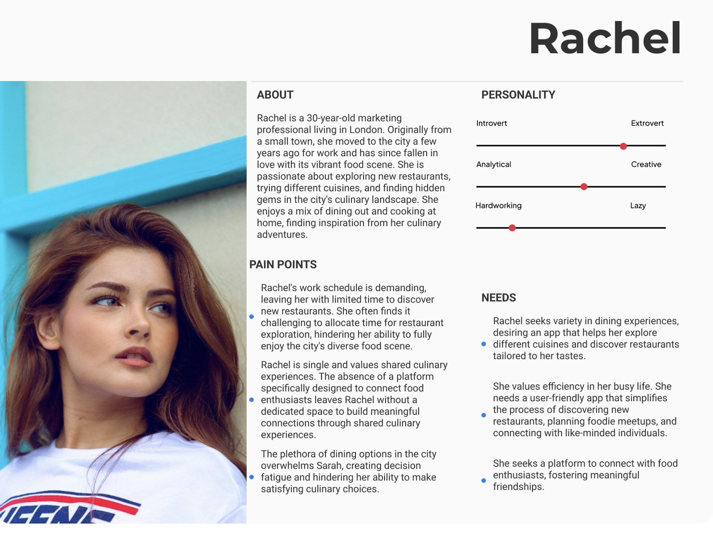
I crafted an empathy map to dive deep into the shoes of the users, like Rachel, understanding not just their actions but their thoughts, feelings, and challenges. This allowed me to pinpoint the pain points and desires, ensuring that the eventual design resonates with their real-world experiences.

Additionally, a user journey map was designed to visually narrate Rachel's interactions with the app. It helped me visualise her entire experience, ensuring that every step of the journey is seamless, enjoyable, and aligned with her needs and expectations.


Colours & Typography

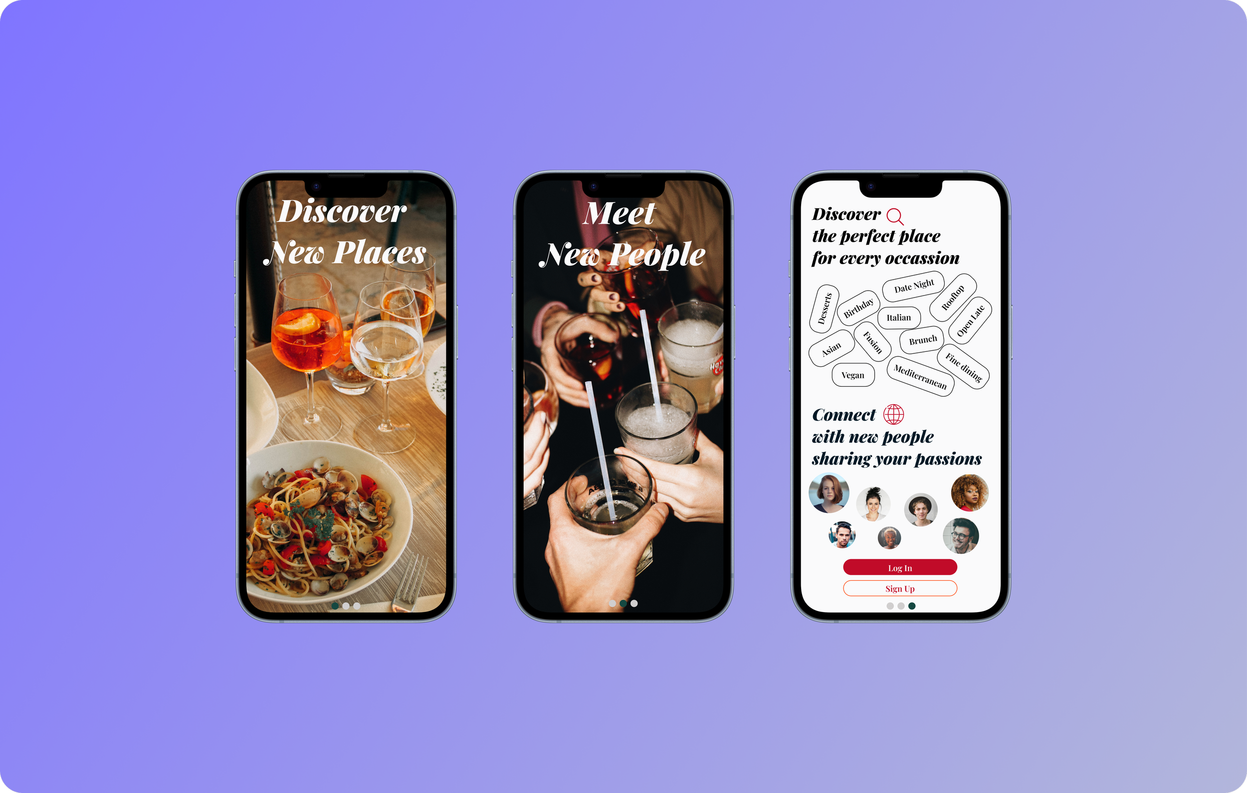
High-Fidelity Prototype


Usability Testing & Design Alterations
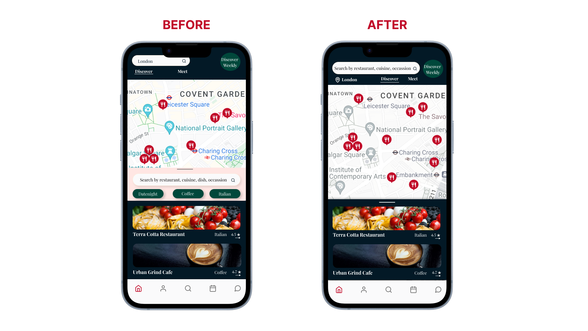
The goal of the usability testing session was to evaluate the effectiveness, efficiency, and satisfaction of users interacting with the product. The session was conducted with three participants. During the usability testing phase, users reported that the home screen of the restaurant discovery app felt cluttered and overwhelming. They found it challenging to navigate due to the numerous elements competing for attention. To address these issues, I implemented several design alterations aimed at creating a more streamlined and user-friendly experience.
Simplified Home Screen
Old Version: The home screen featured a map, a search bar, and multiple suggestion tags (e.g., date night, coffee, Italian) to inspire searches.
New Version: I removed the suggestion tags, leaving only a single, clear search bar that prompts users to "Search by restaurant, cuisine, occasion." This change reduces visual clutter and simplifies the initial user interaction. Additionally, I converted the map to black and white, which made the searched restaurants or nearby restaurants stand out more prominently, improving visibility and ease of navigation.
Optimised Search Bar
Old Version: The city search bar was overly large, taking up valuable screen space.
New Version: I reduced the size of the city search bar, providing more room for the map and making the overall interface cleaner and more spacious.
These design alterations aimed to enhance the user experience by decluttering the home screen and making navigation more intuitive. By simplifying the interface, I tried to allow users to focus more on their primary tasks, such as searching for restaurants and exploring recommendations, without unnecessary distractions. These changes collectively contributed to a cleaner, more user-friendly, and visually appealing application.